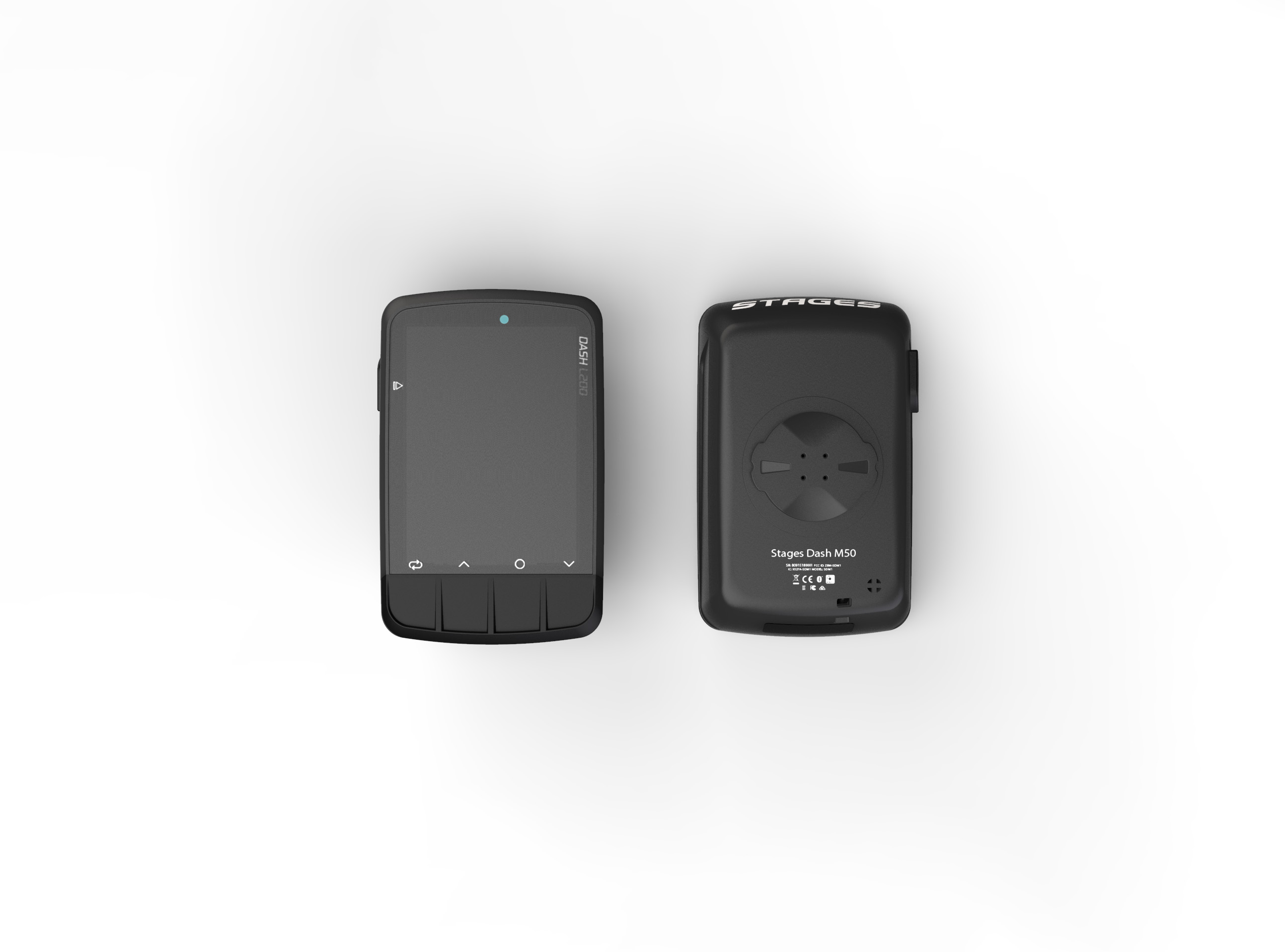
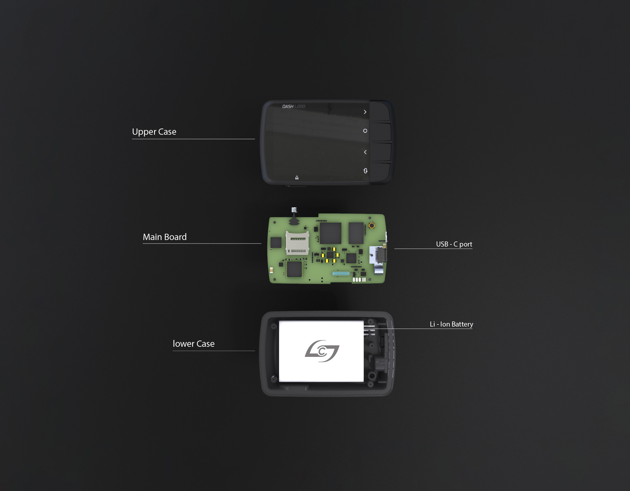
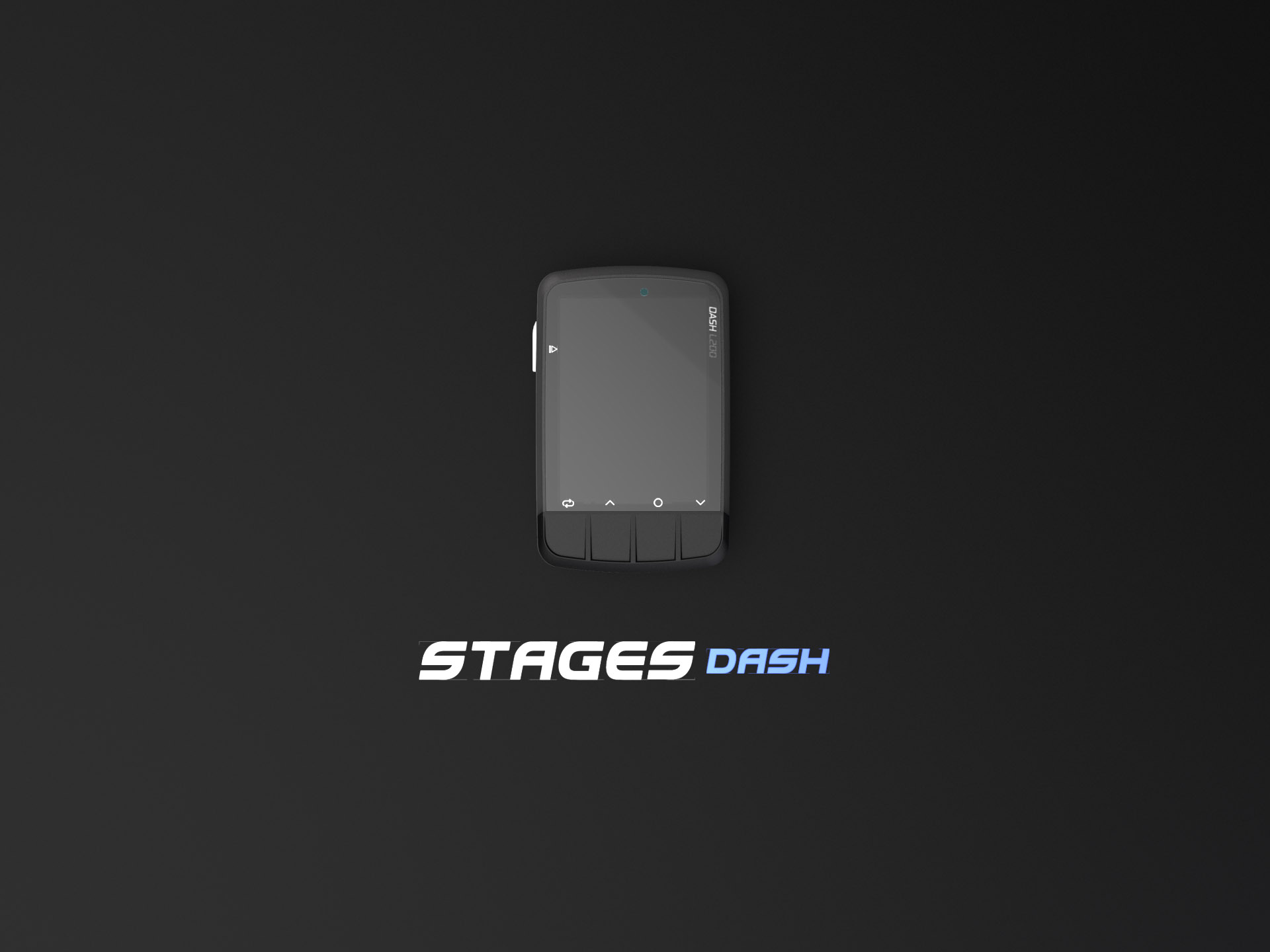
Introducing new components and engineering efforts - the new Dash was built around the most cutting edge componentry. Its design is simplified but great attention to detail was taken in creating complex curvature surfaces over the entire case. Its new battery, screen and boards make it a true revolution for the brand.
INSPIRATION
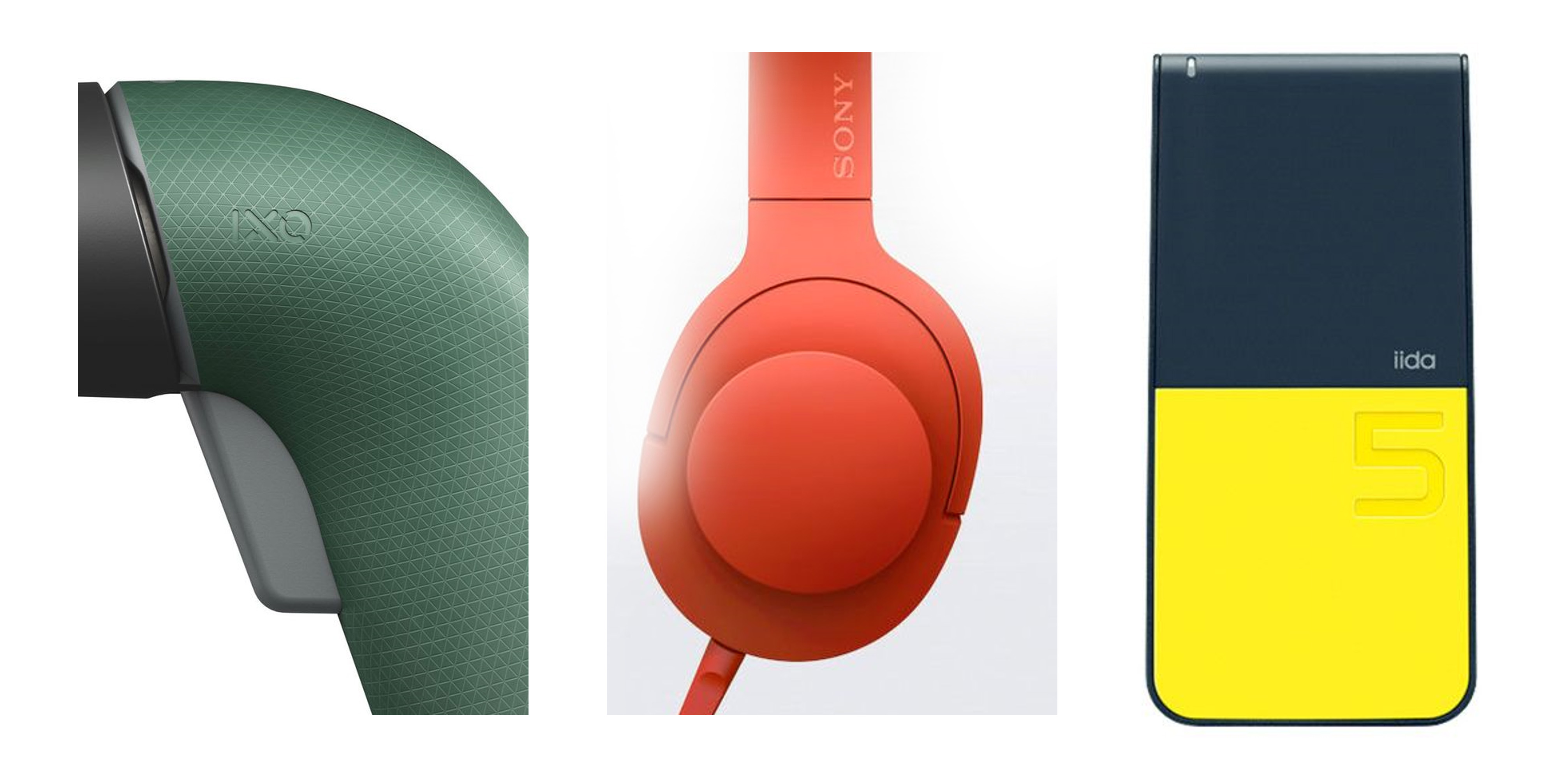
Developing a brand aesthetic for a brand like Stages is a challenge. Very well positioned in the market from a performance standpoint, it was searching for characteristics that allowed the product to be inobtrusive, while allow ease of interaction across the board. The inspiration for the product was a refined approach to surfacing - focusing on tight exchanges of materials and a focus on hiding parting lines. Its design intent was to focus on general surface quality with one or two main elements of attraction; ideally focusing on an area of user interaction.
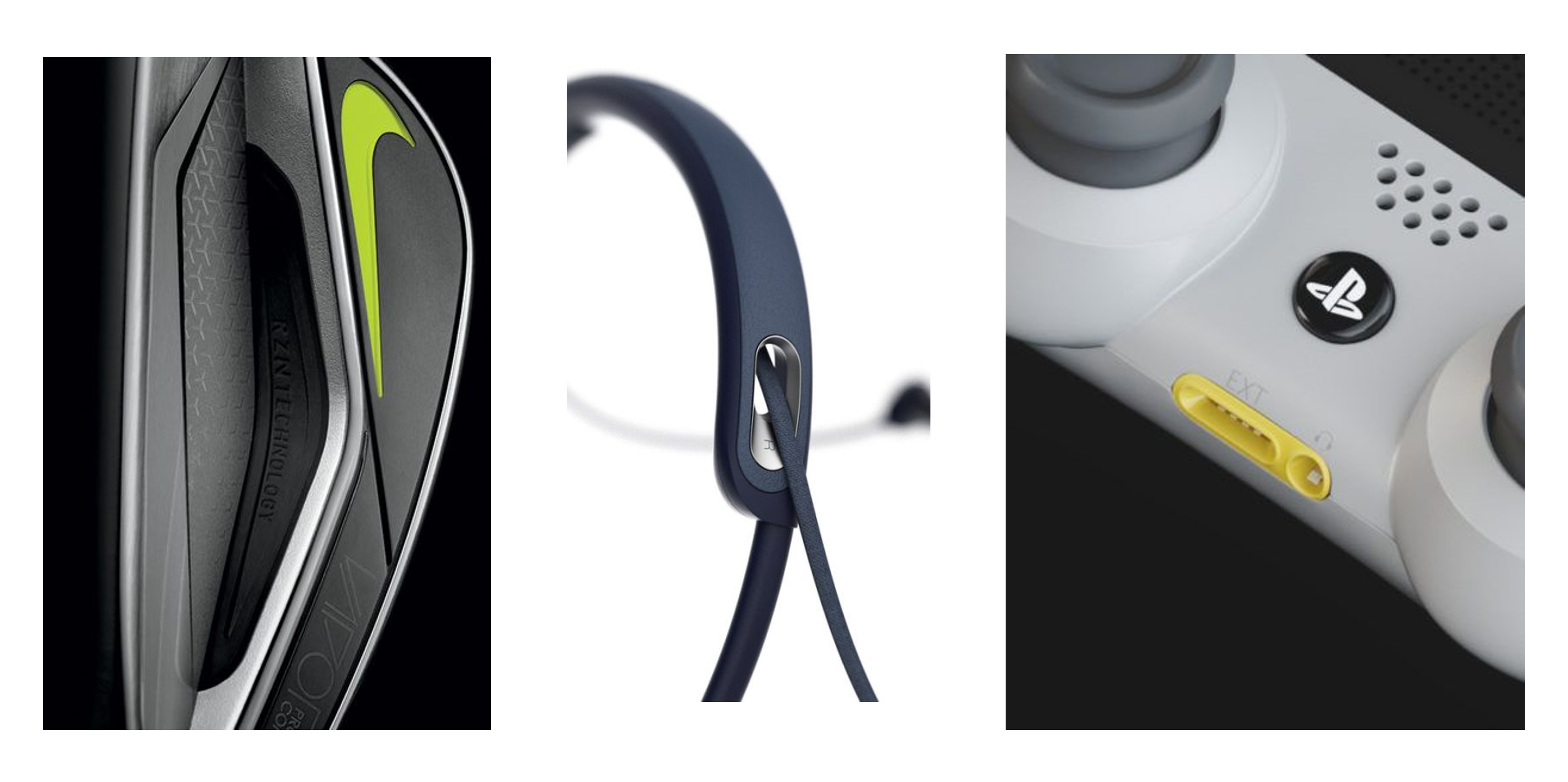
3 - DETAILS
USER FACING SOFTWARE
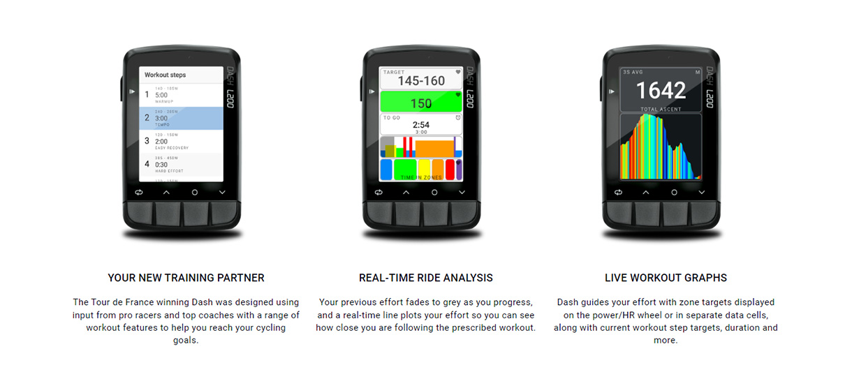
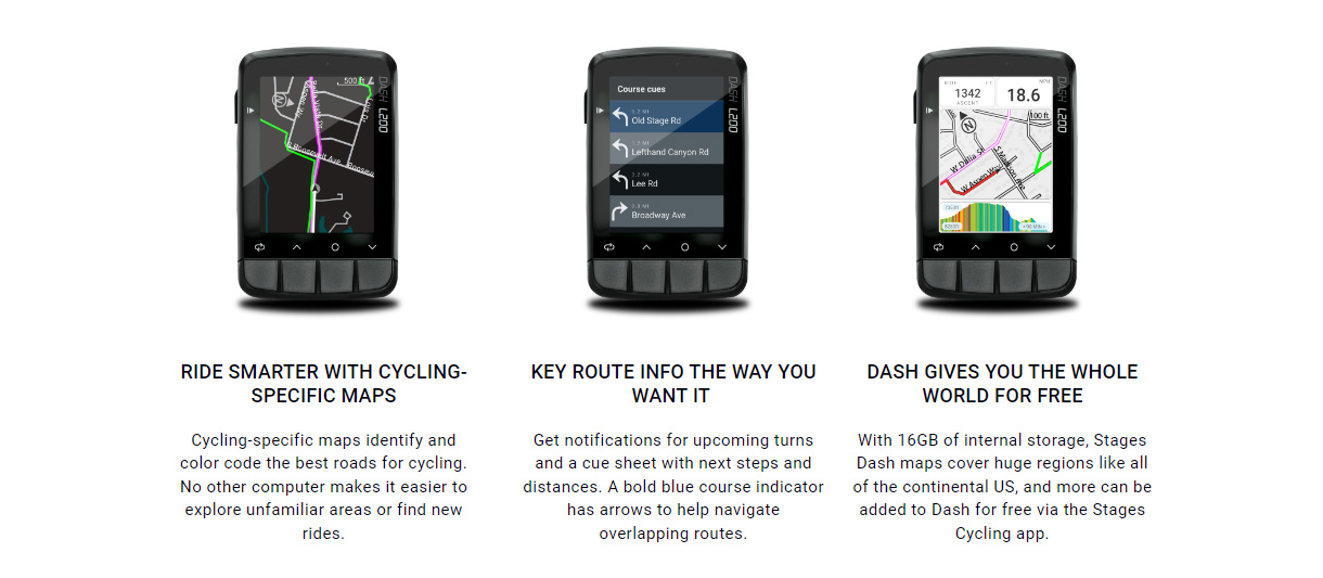
redesigning the hardware was a great opportunity to push Stages into direct competition with the likes of Garmin, Wahoo and Hammerhead. Where Stages truly is second to non is their app platform and training tools. Redesigning the Link app allowed us to design the entire system from the ground up. That means hardware makes sense with front end software design across the entire experience. Maps are always in the same place, files never get lost and more importantly you can customize the interface for the tools YOU need.
4 - CAD DEVELOPMENT
CREATING A PRODUCT THAT LASTS
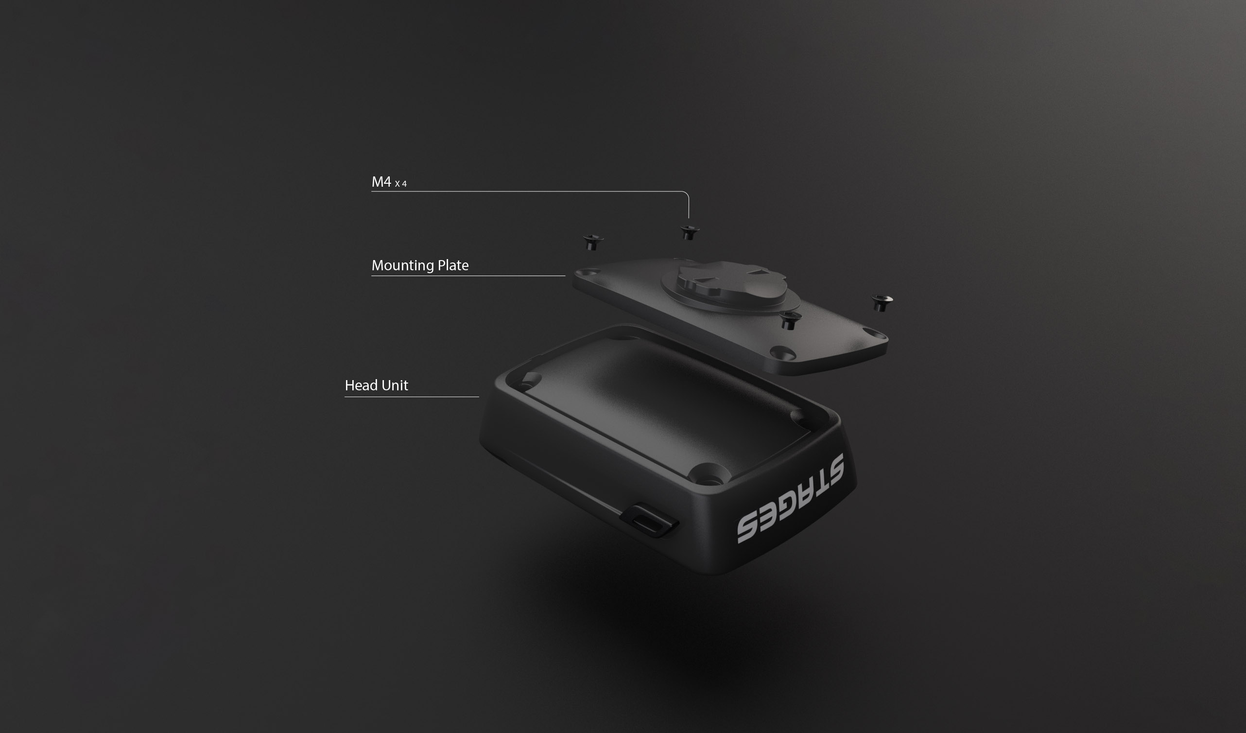
After initial user research - something became very apparent across all head units in the cycling industry - the mounting system, while standardized - is weak. The flanges often snap after sun degradation, or in the event of a semi aggressive shunt. Working with the developers at Stages, I proposed a mounting plate that is independent of the case design, thus making opportunity for any adaptation to new mounts that may be developed in the future or easily replaceable in the event the tabs snap.
Detail - Companies have tried to create a mount that can be changed in the past - but theirs often uses small hardware and is very close to the main stress area of the quarter turn mount. I proposed moving those mounting points away from the high stress areas, buying us a slimmer stack and less stress on the mechanical interactions.
Detail - Companies have tried to create a mount that can be changed in the past - but theirs often uses small hardware and is very close to the main stress area of the quarter turn mount. I proposed moving those mounting points away from the high stress areas, buying us a slimmer stack and less stress on the mechanical interactions.
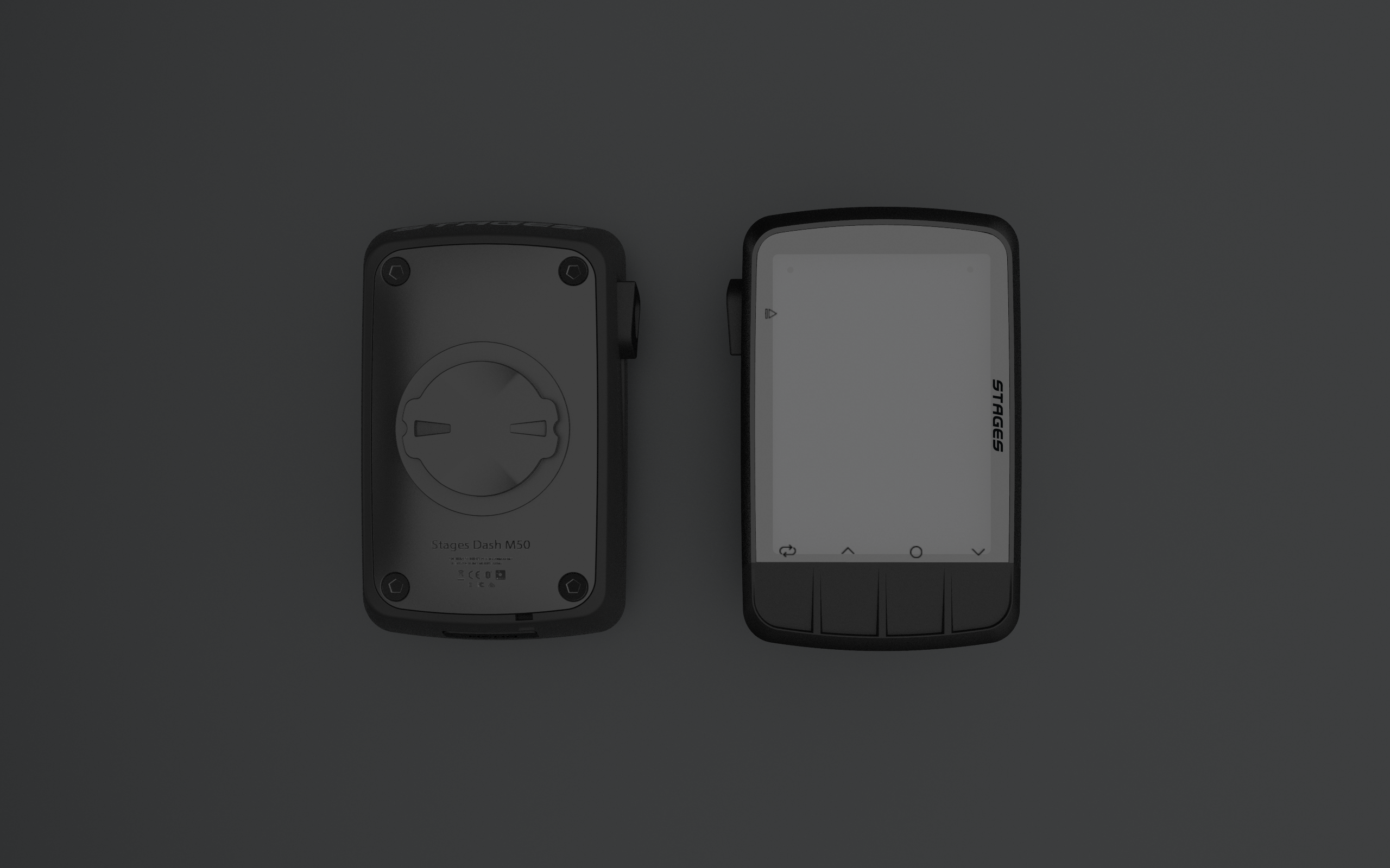
4 - CAD DEVELOPMENT
FINAL FORM
After developing a set of sketches and surfaces that could be moved forward - we worked on developing form in CAD. Using a combination of Rhino and Solidworks - we developed and printed 4 concepts that progressed and refined the design intent of the product. The following images are the final design intent that is currently going into production.